Typographic layout with negative margins
Negative margins in CSS have good cross-browser support and are underused. Using negative margins you can improve typographic layouts without compromising the semantics of your document.
You can see the example in action here
Trying to improve typography 
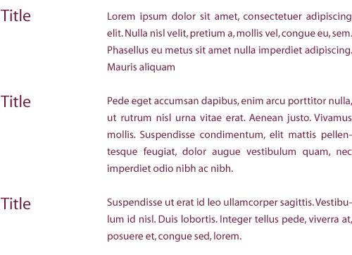
I have been making efforts to improve the typographic layout of my pages. As part of that process I have been looking at things outside the web. A popular trick in brochures and annual reports is to position titles to the left of the main body text. This allows the eye to clearly differentiate between titles and body content.
Possible using CSS 
Initially I thought this would be difficult to achieve in CSS but in fact it is quite straight forward. To achieve the effect you create a holding div and then give it a margin-left. This moves the div away from the left of the page. Then you give the titles (in this case they are h3s) a negative margin to move them outside the div. By floating everything left you ensure that everything lines up nicely.
The XHTML 
<div id="my-holding-div">
  <h3>Subtitle 1</h3>
  <p>
    Lorem ipsum dolor sit amet, consectetuer adipiscing elit. Nulla nisl velit
    snip...
  </p>
  <h3>Subtitle 2</h3>
  <p>
    Lorem ipsum dolor sit amet, consectetuer adipiscing elit. Nulla nisl velit
    snip...
  </p>
  <h3>Subtitle 3</h3>
  <p>
    Lorem ipsum dolor sit amet, consectetuer adipiscing elit. Nulla nisl velit
    snip...
  </p>
</div>
The CSS 
#right-box {
  float: left;
  width: 500px;
  margin: 20px 0px 0px 100px;
  padding: 5px;
}

#right-box h3 {
  margin-left: -100px;
  margin-top: 1.285em;
  clear: left;
  float: left;
  position: relative;
}

#right-box p {
  margin-top: 2em;
  float: left;
}
Good semantics and good typography 
Initially I thought this layout would use two divs. This would have broken up the content and disturbed the semantics of the document. This is bad for search engines and bad for accessibility. Thanks to CSS it is possible to have progressive typographic layouts without sacrificing semantics.
Still haven’t seen the example? You can view it here
Tags
Can you help make this article better? You can edit it here and send me a pull request.
See Also
-
Controlling font size using CSS
CSS offers designers a great deal of control over text and has good browser support. Many web designers overlook Typography, a crucial element of design. This article looks at a best practice method for controlling font size on your website. -
Drop Shadows with CSS
A short tutorial showing how to apply drop shadows to images on your site with CSS. -
Using background images with links
Associating icons with links can in my opinion be a powerful design device. With a small amount of CSS it is simple to add icons into your links.