Drop Shadows with CSS
A short tutorial showing how to apply drop shadows to images on your site with CSS.
What we want to achieve 
Images are everywhere on the web, but rarely is any design love given to them. Most often they are slapped in the page. One technique you can use to give them some style is to apply a drop shadow.
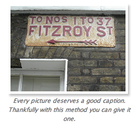
Here’s an image of what we are going to get to:
Can’t wait for the explanation? Go to the example, see it in action and get the source code
Keeping it flexible 
To make our code as flexible as possible we want to use CSS to apply drop shadows to our images rather than make them with drop shadows via Photoshop. That way when the designs need to change we just change the CSS file. Then you can demand a pay rise for the money you have saved!
Making the drop shadow 
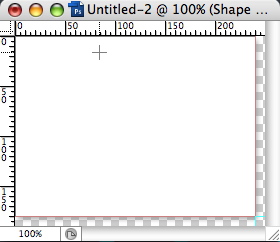
Open up Photoshop and create a new document that is 20 pixels wider and higher than your image. My image is 230 x 170 so I create a new document that is 250 x 190.
If you don’t have rulers visible go to View > Rulers. Then put one ruler at 240 on the horizontal axis and the other at 180. Then using the rectangle tool (shortcut U) draw a white rectangle inside the ruler lines you have just created. Then go to the layers tab and on the layer you have just drawn right click and choose Blending Options. Add a drop shadow with whatever colour you like. Mine is #999999.
At the end of this your image should look like this:
Save this out as a .png and preserve transparency and then a gif too. I’ve called mine drop_border.png and drop_border.gif. More on this later.
The CSS 
For the CSS we are going to create a div and use the image we have just created as a background image. I’m going to give it a class name of drop-shadow. I’m using a class rather than an id as we may wish to use it more than once on a page.
.drop-shadow {
  margin: 20px;
  width: 250px;
  background: url(../images/drop_border.png) top left no-repeat;
  float: right;
}
You will note that the div is being floated right and we have given it a margin too. This is so text will wrap nicely around it. The background image is of course the one we just created. Next comes the image itself:
.drop-shadow img {
  margin: 0px;
  padding: 5px;
  width: 230px;
  height: 170px;
  float: left;
}
The padding of 5px allows a white border to show on all sides before the drop shadow.
Finally we want to add a caption:
.drop-shadow p {
  color: #666666;
  padding: 5px 5px 0px 0px;
  text-align: center;
  clear: left;
  font-style: italic;
}
XTHML 
Now for the markup. Quite simple really:
<div class="drop-shadow">
  <img src="images/fitzroy.jpg" alt="My picture alt" title="My picture title" />
  <p>
    Every picture deserves a good caption. Thankfully with this method you can
    give it one.
  </p>
</div>
To PNG or not to PNG 
I mentioned I would come back to the background image and why we save it as both a .png and a .gif. Internet Explorer 6 and below sadly do not support alpha transparencies. This is the nice see through bit on the drop shadow and why we use a .png file. You might decide to not save your drop shadow as a png but I choose to use a conditional stylesheet to give IE6 and below the dog food it deserves.
<!--[if lte IE 6]>
  <link
    rel="stylesheet"
    href="css/ie6_and_below.css"
    type="text/css"
    media="screen"
  />
<![endif]-->
Then I put this rule in the IE 6 and below stylesheet so it gets a gif rather than a png
.drop-shadow {
  background: url(../images/drop_border.gif) top left no-repeat;
}
Make sure this comes after your main style sheet so it will override it in the cascade.
That’s all there is to it 
You can get the source code or see the example in action. There are probably many other ways to use drop shadows but this works for me. It is cross-browser friendly and works in the following browsers:
Windows
- Firefox 1+
- IE 5+
- Opera 7+
- Netscape 6+
Mac
- Safari 2.0
- Firefox 1+
- IE 5.2
- Camino 1+
CSS3 will make this all much easier with border-image but for now we will have to wait…
Tags
Can you help make this article better? You can edit it here and send me a pull request.
See Also
-
Curved boxes in CSS
Curved boxes are straight forward to do in CSS. Here's a quick tutorial of how to achieve curved boxes in CSS and what's to come in CSS 3. -
Wallpaper for websites
Here's a quick look about how you can give your site some wallpaper. Whilst you are moving the furniture around there is also some traditional wallpaper design for inspiration. -
Contact details in one click
At some stage everyone has laboriously copied and pasted contact details from a website into their address book. Wouldn't it be nice if you could just click a graphic and see the details turn up in your address book?